Some gifs
Apologies for the gap in posting. Ideally I’d like to post more frequently, but I’ve been fairly busy with travel and working on the demo detailed stats app I put together for QB League. That was a fun process, though, and I look forward to making more Streamlit apps in the future – the workflow is a breeze if you know Python and the out-of-the box configs look great.
This post is pretty short, just some cool gifs I made using gganimate while preparing for longer posts coming later.
NBA travel gifs
I’m planning on a post investigating if/how travel affects NBA teams’ performance. In the course of thinking about that, I decided it would be cool to visualize just how demanding an NBA schedule is with so much travel in short time frames. One frame per day, these gifs are kind of long, but I think they do a good job of conveying the scale – both time and distance – of what players and coaches are asked to do.
ATL
BOS
BRK
CHI
CHO
CLE
DAL
DEN
DET
GSW
HOU
IND
LAC
LAL
MEM
MIA
MIL
MIN
NOP
NYK
OKC
ORL
PHI
PHO
POR
SAC
SAS
TOR
UTA
WAS
Bonus stabilization gifs
I received a question about how many bonuses it takes to get an accurate sense of a team’s “true” points per bonus on a set. This is particularly relevant in light of the 2021 ACF Nationals qualifier, which used 100 bonuses to determine qualification for ACF Nationals, which had a COVID-limited field.
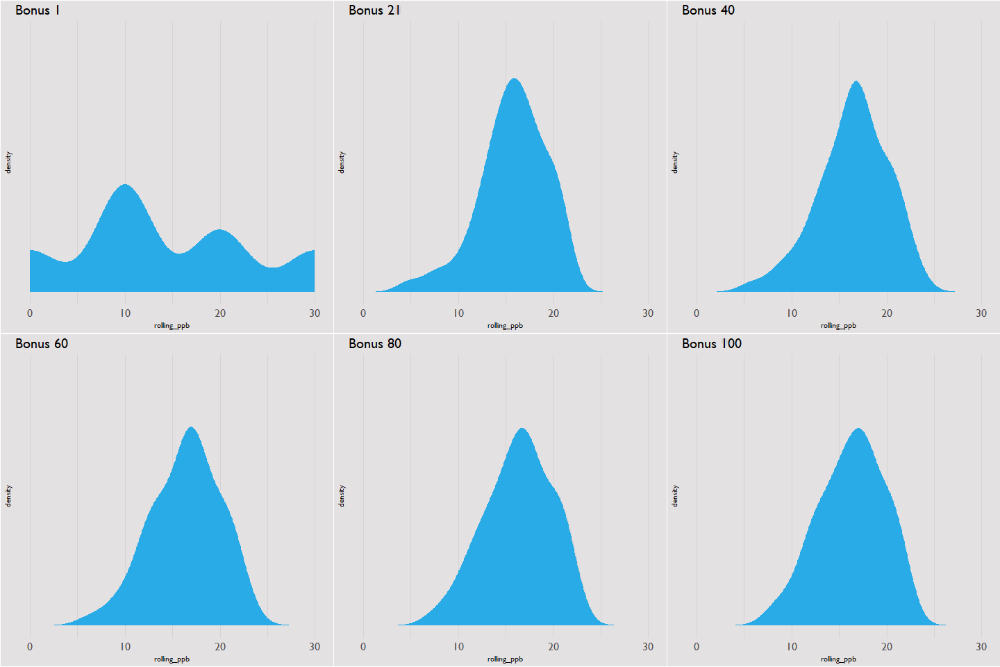
Is 100 bonuses too many? Not enough? To answer that, I looked at how each team’s running PPB varied over the course of the qualifier. Most teams’ PPB had settled in around their final (i.e. after bonus 100) PPB at around 50 bonuses, with all of them stable after 60. Here’s a gif of how the distribution of PPBs changed as bonuses were read:

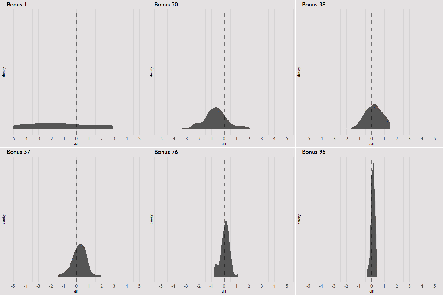
And here’s a gif of how the distribution of differences between a team’s current PPB and final PPB change over the course of the qualifier; after 60 bonuses the differences are constrained to roughly within 1 PPB.

